We are very excited to share our newly updated website with you this week.
For several weeks we’ve been working with website developer, Kevin Brooks, on a fresh new pallette of colors and a reorganization of our site. We love the new look and functionality.
We had a short list of goals for the website update:
- re-fresh the entire site using a new color pallette
- increase the visibility of our “For Your Home” offerings
- simplify the site by combining Academic, Library and Corporate offerings into one section instead of two
- increase the visibility of our blog
- improve the visibility of promotions to our site visitors
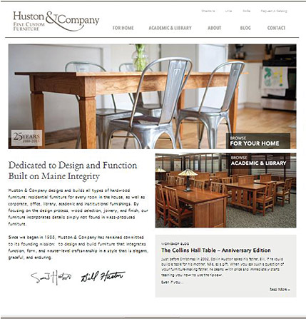
We felt our site had a very strong emphasis on our Academic and Library work, and our residential offerings weren’t getting as much screen-time as they deserve. In an effort to celebrate and promote our core, our residential furniture, we shifted the attention on our homepage.
Research indicated that very few of the visitors to our site were exploring the “Corporate/Small Business” section, so we infused that section into the Academic & Library section, giving the homepage a better balance. We tipped the scales toward “For Your Home” by adding a nice, big, welcoming image of our Willard Square Dining Table right upfront.

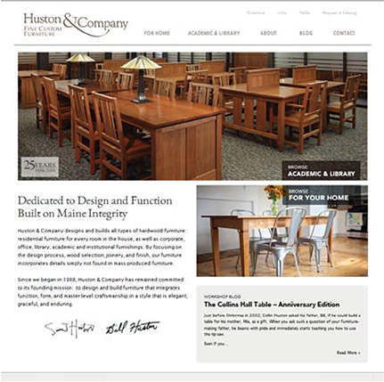
If you’re looking for information on our custom furniture for libraries, schools and universities, you’ll find it easily in the “Academic & Library” section, with a beautiful image of our work at Sacred Heart University right there on the homepage.
And, get this. Our homepage is personalized to your interests. The featured image on our homepage is dependent on what YOU want to see. For example, if you are interested in our handcrafted furniture for libraries and schools, and you click on Academic & Library on our homepage the first few times you visit our site, our site will “understand” that this is your priority. The next time you visit, a large image of our academic work will appear as the feature on the homepage for you, and the residential section will take the back seat. The same is true for those of you who visit hustonandcompany.com to view our residential furniture. Cool, eh?

Our homepage now also features our latest blog post. Now that we are in the midst of our 25thanniversary, we’ll use the blog to announce events and promotions all year long, so be sure to subscribe.
And speaking of promotions, just above the footer, you’ll now find a bar where we’ll display our promotions. In the next few days, you’ll find a link there to information about our Anniversary Edition Collins Hall Tables, now available for immediate sale.

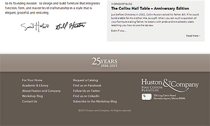
The footer has also been re-freshed. There you’ll find links to our social media pages, a map to our showroom, and links to subscribe to our blog or request a catalog.
Take a moment and explore. We hope you like it.